Homework 5
DS-4630 / CS-5630 / CS-6630 - Visualization for Data Science Homework 5
Three components: Data Generation/Processing, Visualization, and Analysis
Large Language Models (LLMs) are a type of artificial intelligence designed to understand, generate, and manipulate human language. These models are built on deep learning architectures, particularly neural networks with billions or even trillions of parameters, trained on vast datasets consisting of text from books, articles, websites, and other digital content. By learning patterns in how words and phrases are used in context, LLMs can perform a wide range of natural language processing (NLP) tasks, such as text generation, translation, summarization, sentiment analysis, and more. The development of LLMs, such as OpenAI’s GPT series, Google’s BERT/Gemini, and Facebook’s LLaMA, represents a significant advancement in AI, allowing machines to handle language in ways that closely mimic human understanding and communication.
The foundation of LLMs is rooted in the evolution of machine learning techniques, particularly the development of neural network architectures like transformers, which were introduced in 2017 by Vaswani et al https://arxiv.org/abs/1706.03762. Transformers revolutionized NLP by allowing models to consider the context of words across entire sentences, rather than just in a fixed window around each word, making them more accurate and efficient. Since then, LLMs have rapidly grown in size and capability, largely due to improvements in computational power and the availability of massive datasets. These models are now at the forefront of AI research and are being used in a wide range of applications, from chatbots and virtual assistants to creative writing, coding, and even scientific research, demonstrating their potential to transform how humans interact with digital systems and access information.
LLMs are rapidly becoming commonplace in our lives, whether we notice or not. For example, the newest smart thermostat from Google, Nest 3, uses Gemini (a multi-modal language model) to “automatically make micro-adjustments based on your patterns to keep you comfortable while saving both energy and money”. Whether or not this is actually leveraging AI/LLMs to their fullest extent is questionable, but regardless, LLMs are being found everywhere. One striking example of a very successful and widespread usage of LLMs is
Github’s Copilot AI. It uses an advanced language model, based on OpenAI’s Codex, to provide real-time code suggestions, auto-completions, and even generate entire functions or classes based on comments or partial code. While this does sound too good to be true, the numbers back it up. Microsoft’s 2023 early-user survey shows that 70% of users report being more productive while using Copilot, and 77% of users report that they don’t want to stop using it if given the choice. Yet, there are flaws. Copilot/ChatGPT is trained on internet-based sources such as StackOverflow, which frequently contain bad-practice, insecure, messy, or simply incorrect code.
By the way: if you are doubting the usefulness of LLMs for everyday tasks, consider the fact that this entire introduction section was written first by ChatGPT 4 and then edited by a human.
Learning Goals
The learning goals for this homework are the following:
- Encourage students to use LLMs as a tool for visualization tasks.
- Show students the shortcomings/strengths of LLMs.
Implementation
We have provided boilerplate code that you should use to develop your solution.
As in previous homeworks, add your name, your e-mail address, and your UID to the HTML elements at the top. Also make sure your submission generates valid HTML5. Check that it is valid by uploading the DOM content to the W3C HTML Validator or use a browser extension such as Validity.
Other than adding your name, etc., you should not need to edit the html file in this assignment (though you are free to optimize positioning, etc.)
Create your GitHub repo, which includes the skeleton code by visiting https://classroom.github.com/a/pnTOzso5. The project file structure looks like this:
hw5/
    hw5.html
    styles.css
    data/
    	car_engine_data.csv # your generated dataset
        car_engine_data_sample.csv # our generated dataset
        nike.json # provided dataset
    js/
        script.js
Remember, to be able to access the data files with javascript, you will need to be serving the homework directory, not just opening the HTML file in a browser:
cd hw5
# for python 2
python -m SimpleHTTPServer
# for python 3
python -m http.server
Now, you can view the page at http://localhost:8080.
Part 0: LLM Selection
First, gain access to one or multiple LLMs. Some of the most commonplace models are listed below; however, you are free to use any LLM of your choice. Most of these offer some sort of free version or student version.
Before you start, read this article on a few tips about writing better prompts for LLMs. Familiarize yourself with your chosen LLM.
NOTE: Make sure to keep a record of prompts used to generate results, as you will need to submit this as a part of the assignment write-up.
Part 1: Dataset Synthesis
Use an LLM to generate a synthetic dataset that mimics a real-world scenario. For example, you could create a dataset that represents:
-
Customer Transactions: Includes fields such as customer ID, age, gender, purchase date, product category, purchase amount, and payment method.
-
Weather Data: Includes fields such as date, location, temperature, humidity, wind speed, and precipitation.
-
Employee Performance: Includes fields such as employee ID, department, performance score, number of projects completed, and promotion status.
An example prompt could look like (make sure you try a different topic):
Please generate a dataset in CSV format about gasoline engine performance.
The data entries should all take the form similar to:
“{engine_name}”: {
    “manufacturer”: {string},
    “cylinders”: {integer},
    “layout”: {“inline”, “v”, or “flat”},
    “efficiency”: {float},
    “fuel_consumption”: {float},
    “max_hp”: {float},
    “max_torque”: {float}
}
Experiment with modifying your prompt.
- How does the data output change with changes in the prompt?
- If you only provide an initial statement and no additional information, is the data output sensible?
- What if you don’t give any data structure reference?
- Note the results of your experimentation in your report.
Perform a review of the data output and answer the following questions in your report:
-
Does the data generated by the LLM conform to the provided format, if one is given?
-
Does the dataset require any curation, editing, or additional processing? Identify some potential uses for this generated dataset.
-
Are there any trends in the data? If there are, does the trend make sense? If there aren’t, does providing contextual information introduce any trends?
Part 2: Visualization Comparison
Using the synthesized data created in Part 1, create a simple visualization of your choice which showcases any trend in the data. If no trend is present, visualize the data in a way that shows this. Use D3 for the visualization. Ensure that this visualization conforms to best practice and accessibility guidelines. In your report, report your reasoning for your choice of visualization, as well as any visual encodings and choices made when designing the visualization. If your data generated in Part 1 is unusable, use this provided car_engine_data_sample.csv (engine performance), generated by chatgpt4.
Now, use the LLM to attempt to generate the same visualization, using the same data. This should be done through the generation of D3 code, NOT through image generation. Copy the produced code into your D3 environment and check the output. Does the chart look like yours? Change/add any styling necessary to match the two charts.
An example prompt might look like:
Using the data above, generate d3 code to create a line histogram with the x-axis being binned cylinder count and the y axis being maximum horsepower.
Note any significant differences between the LLM generated chart and your own in your report. This section should also include a rough estimate of which method took you more time.
Additionally, note which method you found to be most useful. Do you think that with further prompt refinement you could use the LLM to generate meaningful visualizations for generic datasets and different styles of visualization?
Part 3: Visualization Creation

-
Using this dataset
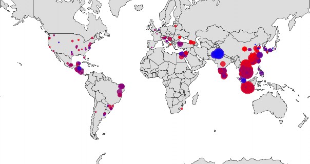
nike.json, use the LLM to generate a geographic world map that first shows the distribution of factories and the number of workers. Each factory should be represented as a circle, with the radius of the circle being proportionate to the number of workers present. The circle should be color tinted based on the percentage of female workers at the factory. Values <50% should be 1 color, and values >=50% should be another. Choose an appropriate color scale, or use the LLM to do so and reflect on whether it made a good choice.- Did the LLM make any assumptions?
The output map should look something like the image to the right (using Mercator projection)

-
Copy the output code and paste it into your local D3 environment and review the code quality and standards.
-
Does it run immediately without error? If not, are the issues obvious?
-
Is the format/style of the code consistent with your own?
If the code does not work out of the box (it likely won’t), make any adjustments and note what changes need to be made. Note the process required in your report.
-
-
Now that you have it running, review the resulting visualization. Does it look similar to the example above? What are the major differences, if any. Make necessary changes to style your map.
-
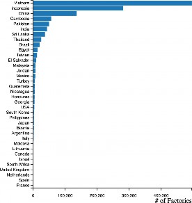
Now add a histogram bar chart to the side of the world map. This should show the amount of factories per country. An example vertical bar chart is shown right.

-
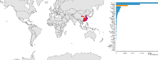
Now that you have the histogram rendering to the side of the chart. Make the histogram interactable. You should be able to click a bar (country), or a country on the map and it will then update the map to only show factories in that country. The bar in the histogram should indicate that it is selected. An example where China has been selected, and the global map only shows Chinese factories is shown to the right.
Reflect in the report about the difficulty of using an LLM and what strengths and weaknesses it has in comparison to traditional methods.
Submission
Commit and push your code and report to your repository.
Grading
Part 1 (20%)
- Synthesis reflections
Part 2 (40%)
- Your selected visualization
- Reasoning for choices in visualization
- Comparison reflections
- Final prompts used
Part 3 (40%)
- Design choices made for your visualizations
- Reflections on the usefulness of LLMs as a tool for creating complex and intentional designs for data visualization
- Final prompts used