
Homework 5
DS-4630 / CS-5630 / CS-6630 - Visualization for Data Science Homework 5
In this assignment you will visualize polling data and predictions from the 2022 US senate election. The goal of the homework is to visualize the predicted margin of victory for the candidates in each state, but to also show the uncertainty in the race as of late September. Finally, we also want to show the “raw” data underlying these predictions – the polling data.
We’ve retrieved the data from FiveThirtyEight’s website. Also take a look at how FiveThirtyEight visualizes their 2022 forecast. And finally, our design is inspired by they way visualize the senate race.
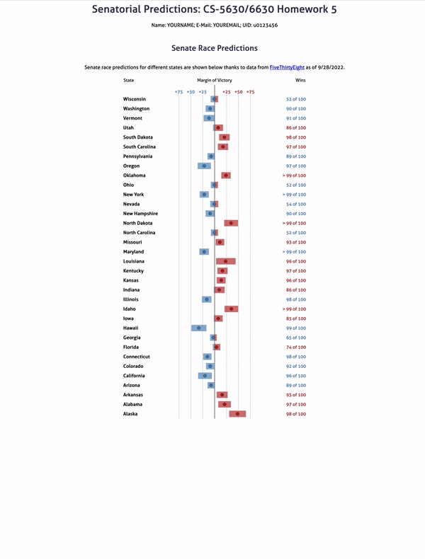
Your final visualization should look roughly as follows:
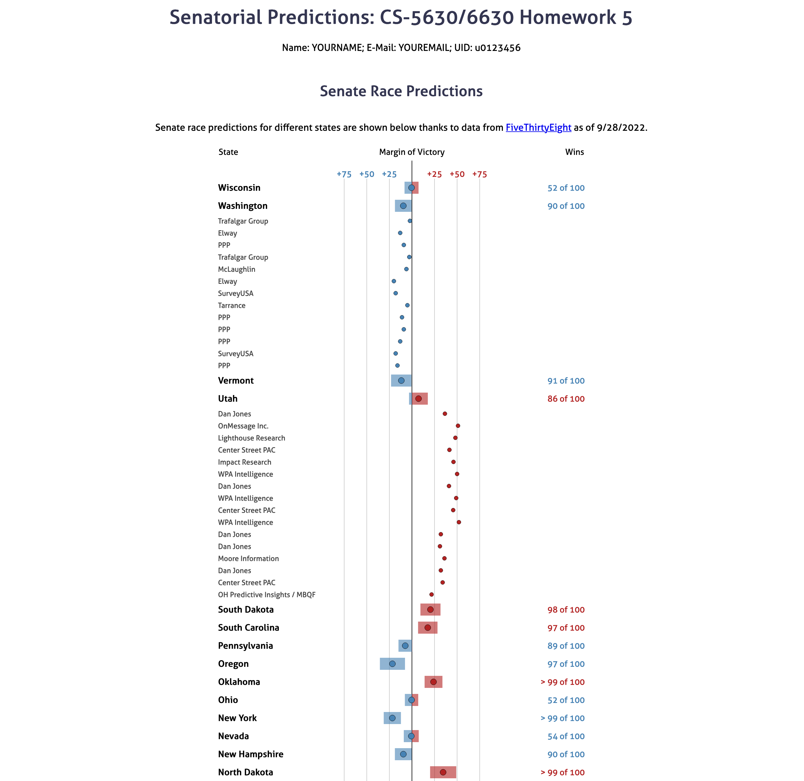
Note that this design isn’t perfect – we’re simplifying a lot here. For example, we’d probably want to also show the date at which a poll was taken in a “production” visualization, how reliable to poll is, and we’d probably also want to show how important each state if for the electoral college. We also might want to add a visualization for the overall win probabilities. Finally, we’re making the simplyfing assumption that for every state, there’s a Democrat and a Republican. That’s not true in Utah, where one of the two likely winners is an independent. We’ll still count independents as belonging to “the other party”. We’re not doing that here to keep the homework simple.
Learning Goals
The learning goals for this homework are the following:
- Creating custom visualizations with several components (dots and rectangles for predicted margin of victory).
- Selecting elements based on their data fields and not on their class or id.
- Reinforce the logical association of data to elements and how they are passed down from parent to child element.
- Deriving a dataset, i.e., making a data transformation, by aggregating using
d3.rollup()(extra credit only).
Implementation
We have provided boilerplate code that you should use to develop your solution. Note that you’re free to diverge from our suggested solution, as long as you (a) stick with D3 and (b) can justify your choices.
As in previous homeworks, add your name, your e-mail address, and your UID to the HTML elements at the top. Also make sure your submission generates valid HTML5. Check that it is valid by uploading the DOM content to the W3C HTML Validator or use a browser extension such as Validity.
Other than adding your name, etc., you should not need to edit the html file in this assignment (though you are free to optimize positioning, etc.)
Create your GitHub repo, which includes the skeleton code by visiting https://classroom.github.com/a/oKu_WbF7. The project file structure looks like this:
hw5/
    hw5.html
    styles.css
    assets/
    data/
    	senate_forecasts.csv # Model predictions for different states.
    	senate_polls.json # Different state polls.
    	senate_polls.csv # The original data for polls.json. This is only used if you attempt the extra credit.
    js/
        script.js # initialization, you only need to change this if you attempt the extra credit.
        table.js # the table implementation
Remember, to be able to access the data files with javascript, you will need to be serving the homework directory, not just opening the HTML file in a browser:
cd hw5
# for python 2
python -m SimpleHTTPServer
# for python 3
python -m http.server
Now, you can view the page at http://localhost:8080.
Wrangling the Data (extra credit)
We provide code that loads the data for you from senate_polls.json and senate_forecasts.csv. senate_forecasts.csv has many different data fields, we will only use a few of them.
The relevant columns in senate_forecasts.csv are :
| Column | Description |
|---|---|
state |
Name of the state |
winner_Dparty |
Chance the democrat will win the state |
winner_Rparty |
Chance the republican will win the state |
mean_netpartymargin, p90_netpartymargin, p10_netpartymargin |
Forecasted margin, including the upper and lower bounds of an 80% confidence interval |
Please note, that we have cut 1 senate race for the simplicity of the visualization and interaction. In Oklahoma, there are 2 races, but it would be tricky to join across tables by just the state name with that data. We decided to cut the race between Kendra Horn, Markwayne Mullin.
The relevant columns in senate_polls.csv are (from the FiveThirtyEight Readme):
| Column | Description |
|---|---|
state |
Name of the state |
pollster |
Name of organization that conducted the poll. |
poll_id |
ID for a given poll. (responses for each candidate is on a separate row, so this attribute links them together.) |
question_id |
ID for a given question. (needed to distinguish between multiple questions on the same poll) |
pct |
the polled prediction for the given candidate. |
party |
the party chosen in the poll (e.g. democrat or republican) |
If you are going to attempt the extra credit you need to load senate_polls.csv and group by the state and poll_id in order to get a list of polls for each state. Your final structure should be something like the following:
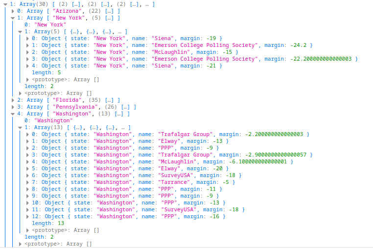
That is, it should be a Map object where the keys are the states, and the values are an array of polls. Notice, that each poll is condensed into a single element where we store the name of the pollster, the state (for convenience later), and calculate the margin as the difference in pct between republicans and democrats. If you do not change the code in script.js you will get a structure like this.
We recommend completing the other parts of the assignment first, and only to attempt the extra credit once they are working, as it will be easier to confirm if you are wrangling the data correctly.
You can do this aggregation in any way that you want, but we strongly suggest looking at d3.rollup for d3 version 7. This makes it possible to do this combining/aggregation in a very succinct way.
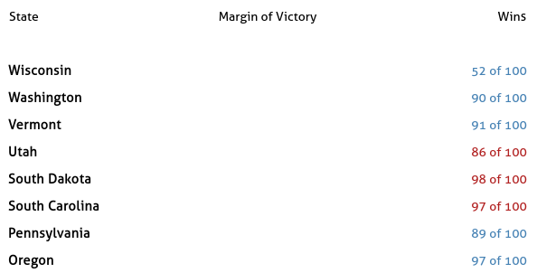
Part I: Populating The table
We provide a decent amount of code for this assignment. Even though we provide everything needed in the constructor of the Table class, you should read through this set-up code so you are familiar with class variables you can use in other functions (such as this.scaleX).
In addition, we provide most of the structure in the drawTable function, and call it for you from the script.js file. However, you still need to add some code here to start seeing parts of the table appear.
You will use the forecastSelection variable to populate the text cells of the table. This will be done in two steps. First, filter the selection to only include the cells of type text, then simply set the text based on the data. The important thing to trace through at this point is what is contained in the data element. Since we are transforming the data in these calls to selection.data this can be a bit tricky, but the place to look carefully is the rowToCellDataTransform function. After you understand that flow, it will only take a small amount of code to filter the selection based on the data. Notice that we can use a d3.selection.filter here, which is not to be confused with vanilla JS filter functions.
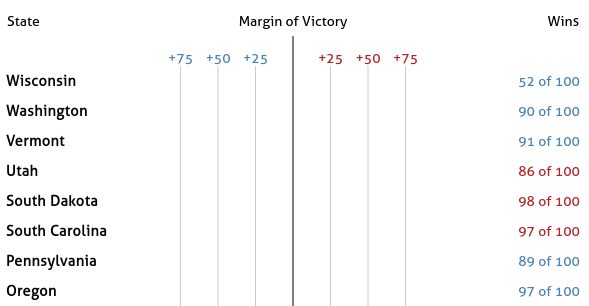
At the end of this step your table should look like the following:
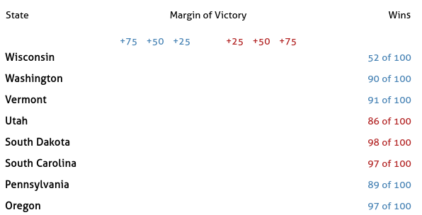
Part II: I am Legend
Next add the legend in the Margin of Victory column. The HTML has already been pre-populated with an SVG container here. Simply select the SVG with id marginAxis, set the width and height, add a line in the middle, and add labels for the gridlines.
At the end of this step your table should look like this:
Part III: Add Gridlines
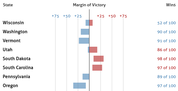
Next add gridlines to each SVG in the “Margin of Victory” column. To do this you can add code to the addGridlines function. We already call this function in drawTable, where we pass in the selection that contains the list of group elements – One group per SVG. The ticks variable holds the values that the gridlines should pass through. After this step you should get:
Part IV: Add Bars
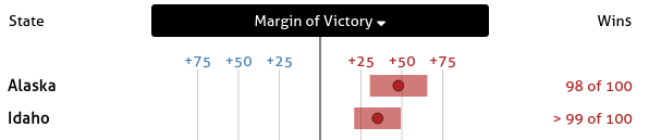
Next we will implement the bars showing the confidence interval. Update addRectangles using a similar containerSelect variable. Notice that in cases where a margin range crosses the center line you will need two rectangles as opposed to just one, as you want two different colors for the parts left and right of the center line. You should trace through the existing code to see what data is bound to this selection. Ultimately this range should refer back to margin_lo and margin_hi in forecast.csv. The result should look like this:
Part V: Add Dots
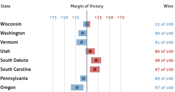
Finally we finish the state-wise predictions chart with a dot to represent the margin attribute by writing code in the addCircles function. Notice how the dots are colored based on who is predicted to win, similar to the bar charts.
Part VI: Add Sorting Functionality
Next we will add the ability to sort based on any column by clicking the column headers.
- In
attachSortHandlersadd a click handler for eachthelement inside the row with idcolumnHeaders. - In the actual event handler you should sort the the array
this.tableDatabased on the column you selected.- State – sort alphabetically.
- Margin of Victory – sort by the absolute value of the
marginattribute.
- Selecting a column more than once should toggle the sorting between ascending and descending.
Hint: using this.headerData may help you keep track of the current sorting state.
At the end of these steps the rows should be sorting when you select different columns. See the video below for a demonstration.
Part VII: Update Headers Based on Sorting
It is good practice to make the current state of the sorting obvious in the UI. Here, it should be clear which column is driving the sorting and whether it is sorted by ascending order or descending order. We will use a black background color for the column that is driving the sorting, and an arrow icon do indicate the direction.
For example in this screenshot values are being sorted in increasing order by state name:
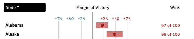
Here, the table is sorted in decreasing order by the margin of victory:
We suggest the following approach:
- add a
sortingclass to thethelement that is used for sorting. This class is already defined instyles.cssto have the black background and white text. - Notice the
ielements in the html file. These are pulling icons from font-awesome. They all also start with the classno-displayThis class prevents the icon from being displayed. When you want to show an actual icon, remove theno-displayclass from theitag. To get the correct tag you need to make sure thefa-<iconkey>is set correctly. For example, here we are usingfa-sort-upfor ascending andfa-sort-downfor descending icons. Feel free to pick different icons from their gallery as long as they make sense. The important things is to only have one of these classes applied at a time.
Part VIII: Polling contributions
The final step is to incorporate the polling data into this chart. Specifically, we want to be able to select a state and see all of the polls for that state displayed under it in the table. We have already attached the click handler so that toggleRow will be called each time a state row is clicked.
Please note, there are some states without any polling. Those are: Oregon, North Dakota, Idaho, Hawaii, California, and Alabama.
In this function you will need to either expand or collapse the row, based on it’s current state. You will have to either add or remove all of the polls that correspond to the state that was clicked from this.tableData. After this.tableData is updated you must call drawTable again.
Now that this.tableData could include both aggregate state predictions and individual polls you will have to go back and make a few updates. Specifically:
addRectanglesshould not add any rectangles for the individual polls, even if they are not visible in the plot.addCirclesshould distinguish the circles plotted for state aggregates from individual polls by making these circles smaller.
In the following example you can see both Utah and Washington expanded.
Note 1: There are some states that do not have any polling data in the dataset. For the purpose of this assignment, nothing should happens when you click these states.
Note 2: To keep the sorting simple, for a basic implementation you should just call this.collapseAll before sorting the table, i.e., when you sort, all individual polls are hidden.
Extra credit
As mentioned in Note 2, the basic implementation will collapse the groups before sorting. To receive extra credit you should not automatically collapse these groups, and instead:
- Keep the state polls grouped under their state.
- Sort the the polls within its group.
DONE!
Your final solution should behave something like this (full resolution download):
Grading
- 5%: Extra Credit 1 (Data Loading): Data is loaded from the CSV file. JSON file isn’t used.
- 5%: Part I: Table Text Elements.
- 5%: Part II: Plot Legend.
- 15%: Part III: Gridlines.
- 15%: Part IV: Bar charts.
- 15%: Part V: Circle plots.
- 15%: Part VI: Sorting table elements.
- 10%: Part VII: Showing sort state in headers.
- 20%: Part VII: Table subgroups.
- 5%: Extra Credit 2: Sorting works with groups open.