
Cascading Style Sheets and Selectors
Based on material by Carlos Scheidegger and Kevin Sun
HTML specifies the content of a web page, but plain HTML says relatively little about how the content looks. This is where CSS comes in. CSS stands for Cascading Style Sheets: they are external declarations that control the way your elements will get rendered by a web browser. A full discussion of CSS syntax is, as usual, given at the MDN CSS website; we show the very basics here.
A stylesheet will usually consist of a list of CSS rules that are inserted in <style> elements in the HTML header, <head>. A single CSS rule associates a CSS selector with a set of CSS declarations.
More important than styling, however, are the rules on how we identify elements in the dom, the selectors.
CSS Element Selectors
Let’s look at a very simple CSS rule:
See output in new page.In this rule, strong is the element selector, and each line inside the curly brackets is a declaration.
Roughly, the way this goes is: for every DOM element with tag name strong, make its background color brown, and its font size 150% of the base size.
CSS rules are applied in order that they appear in the document, and if more than one rule matches the element, then they both apply (there is more nuance than this, but for now that’s OK). For instance, the example below is entirely equivalent to the above:
See output in new page.CSS Class Selectors
CSS selectors can be much more powerful than selecting on element names. For example, we can create user-defined “classes” of styles. Classes allow us to define certain elements to be of a specific type that is then formatted consistently. Here is an example with “important” text and a “footnote”. Both are in a <div>, but they have different semantics, and we also want to display them differently.
Class selectors are identified by a leading period ., e.g., .important in CSS.
Note that we can also apply multiple classes to a single element, as you can see in the important footnote.
CSS ID Selectors
ID selectors work similar to class selectors, but IDs may only be used once for an element in the DOM (as is often the case in HTML, this isn’t enforced by the browser, but you SHOULD definitely do it). ID selectors are identified by a leading hashtag/number/pound sign #, e.g., #header. You can use IDs as “anchors” to refer to a site by appending #idname to the URL. For example, following this link (#css-id-selectors) will scroll your browser to this section.
But you can also use IDs to apply custom styles in CSS:
See output in new page.You can also use the combination of IDs and CSS to create layouts of a page:
See output in new page.However, nowadays, you should use CSS Grid Layouts to lay out a potentially responsive web page, which we’ll discuss in a few minutes.
CSS Relationship Selectors
CSS selectors let you match elements based on their relationship with other elements. While I will simply refer you to the MDN Selectors webpage for the full reference, I want to highlight two particularly important ones: the child selector and the descendant selector.
The child selector matches every time an element is directly enclosed by a different element. For example, consider the following rule involving the child selector:
See output in new page.Multiple Rules in CSS
When more than one CSS rule matches, then different CSS declarations might conflict with one another. In that case, “the most specific declaration wins”. The rules for what counts as more specific are really disgusting, so if you find yourself debugging CSS code because the styles “don’t take”, the first thing you should try is to set completely different classes for the element and add all the declarations to this class. Then, with help from the Developer Tools, you can add classes back to your element to see which declarations might be winning the specificity race. In order to avoid this kind of trouble, it’s better to stick to simple declarations as much as possible.
A cool method to debug is to edit CSS directly in the inspector!
Pseudo Classes
Pseudo classes are selectors for states that can be combined with other selectors. Typical examples are :hover, :visited, or :nth-child() which can be used like this:
Layouting with CSS Grid Layout
The CSS Grid Layout is a modern and helpful way for laying out content on a webpage. Back in the day, we used to use tables to do this. That was followed by complicated css floating arrantements, and then finally by libraries that provided something like today’s grid layout.
The grid layout, however, is now a standard part of CSS.
The basic idea is that everything that’s laid out is inside a wrapper that specified that the contents of that wrapper are manged with a grid layout using display: grid;
In the following, we’ll want to construct a page with a header that contains a menu (the <nav> element), two “views” (see the <div> elements) that could contain visualizations, a sidebar specified in the <aside> element that could e.g., show contextual information, and a footer (see <footer>). We’ll work on arranging this step by stesp.
When we simply add these elements to a grid, they are laid out in separate rows:
See output in new page.Now, with grid-template-columns, we can specify how many columns we want to have. We start by specifying three columns with 200 px each. Note that the columns appear and the elements “wrap around”.
Instead of specifying widths in pixels, we can also specify them in “fractions” using the fr unit. A fraction is automatically calculated to be an equal part of all of the unallocated space. So in the example below, 150px 2fr 1fr results in the first column being exactly 150px wide, the second having 2/3 of the remaining width, and the third having 1/3 of the remaing widht:
By deafault, rows are set to be part of an “implicit grid”. We haven’t specificed rows before, but they still appeard. We can set some properties such as the height of the rows with the grid-auto-rows command. If we want an ”explicit grid”, then we can also do this with grid-template-rows.
Now, a key property of the grid layout is that I can flexibly define cells based on lines. You can take a look at the lines in your inspector, but the follwing figure shows the idea:
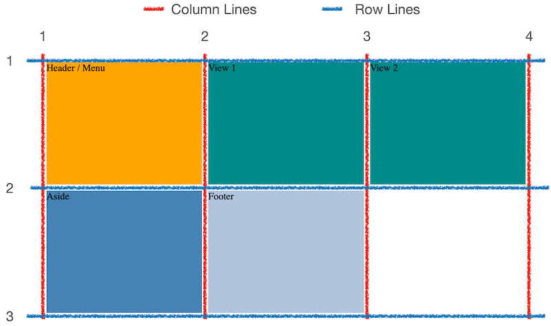
Lines begin on the left for column lines, or from the top for row lines, at line 1, and go to after the last column / row. So we can specify that a particular container should go from column line 1 to line 3, or from row line 4 to line 7, etc.
We do this either with grid-column-start and grid-column-end (or the row equivalents), or with a short-hand: gird-column: 2 / 4. Here’s an example, which also represents our final, desired layout:
Finally, we can also nest grids. Here we’ll add a tool-bar to the menu at the top, which should hold at most 4 buttons per row.
See output in new page.There is of course more to learn about css grids. Take a look at this nice MDN tutorial
Other ways of declaring CSS
You can provide CSS stylesheets as an external file. This is very useful when you want to share CSS rules across many different documents. In that case, you include the following element in your <head>:
<link rel="stylesheet" href="style.css"/>
In this case, style.css should be an additional file that consists entirely of CSS rules.
Finally, you can place CSS declarations directly inside an element. You do this using the style attribute, which most HTML elements support.
See output in new page.It’s a bad idea to do this in HTML that you write manually: you’re mixing content with presentation, and making it hard to reuse the declarations. But later on we will be writing code to generate elements in the DOM for us, and in that case, this will be a very common and good thing to do, because in that case reusability will be achieved in our Javascript source code.